
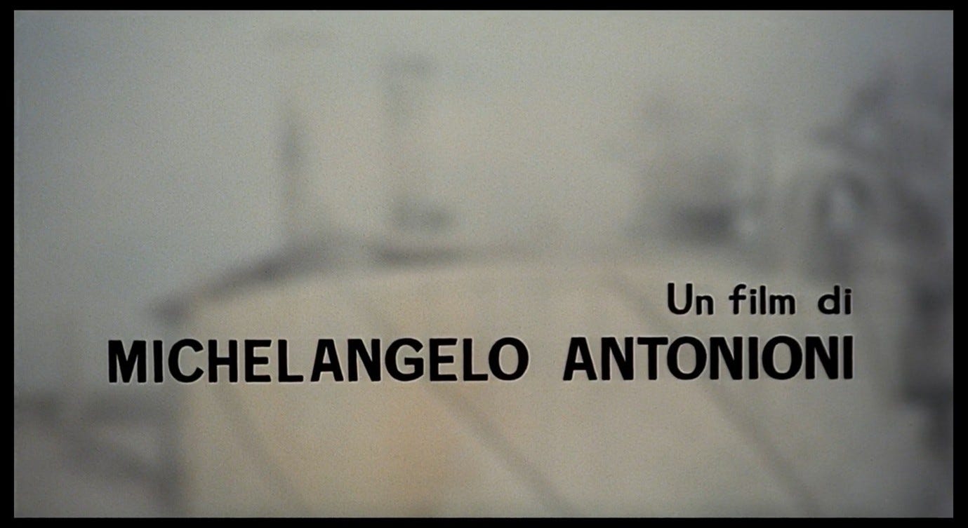
Everything That Happens in Red Desert (2)
The desert and its colours

The images and text in Red Desert’s title sequence prompt us to begin asking questions about deserts (of various kinds), colours (natural and artificial), paint (of a very specific brand), and pink beaches. What does this film’s title mean, and where does it come from? What do these colours mean, and where do they come from?
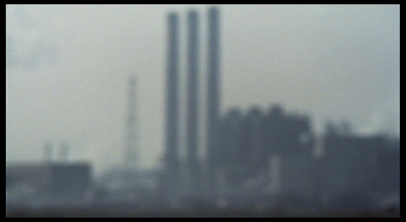
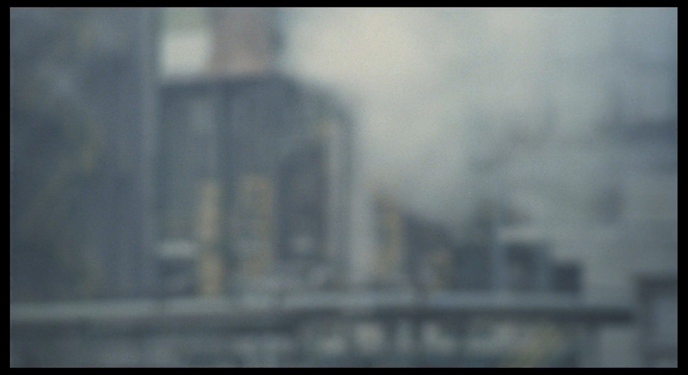
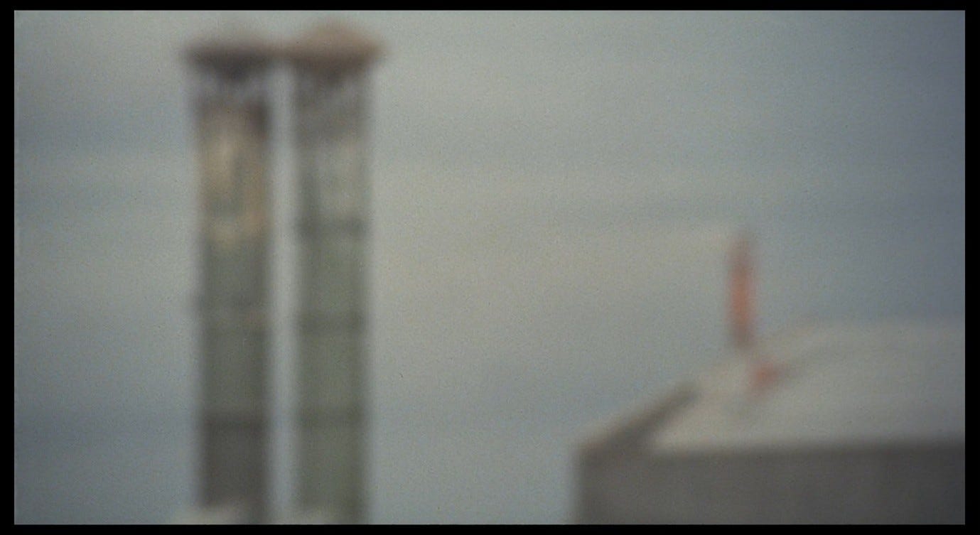
When the camera first discovers the Ravenna factories, we see that there are thin yellow lines running down the sides of these metal towers. It is worth pausing to note the introduction of this highly significant colour.1
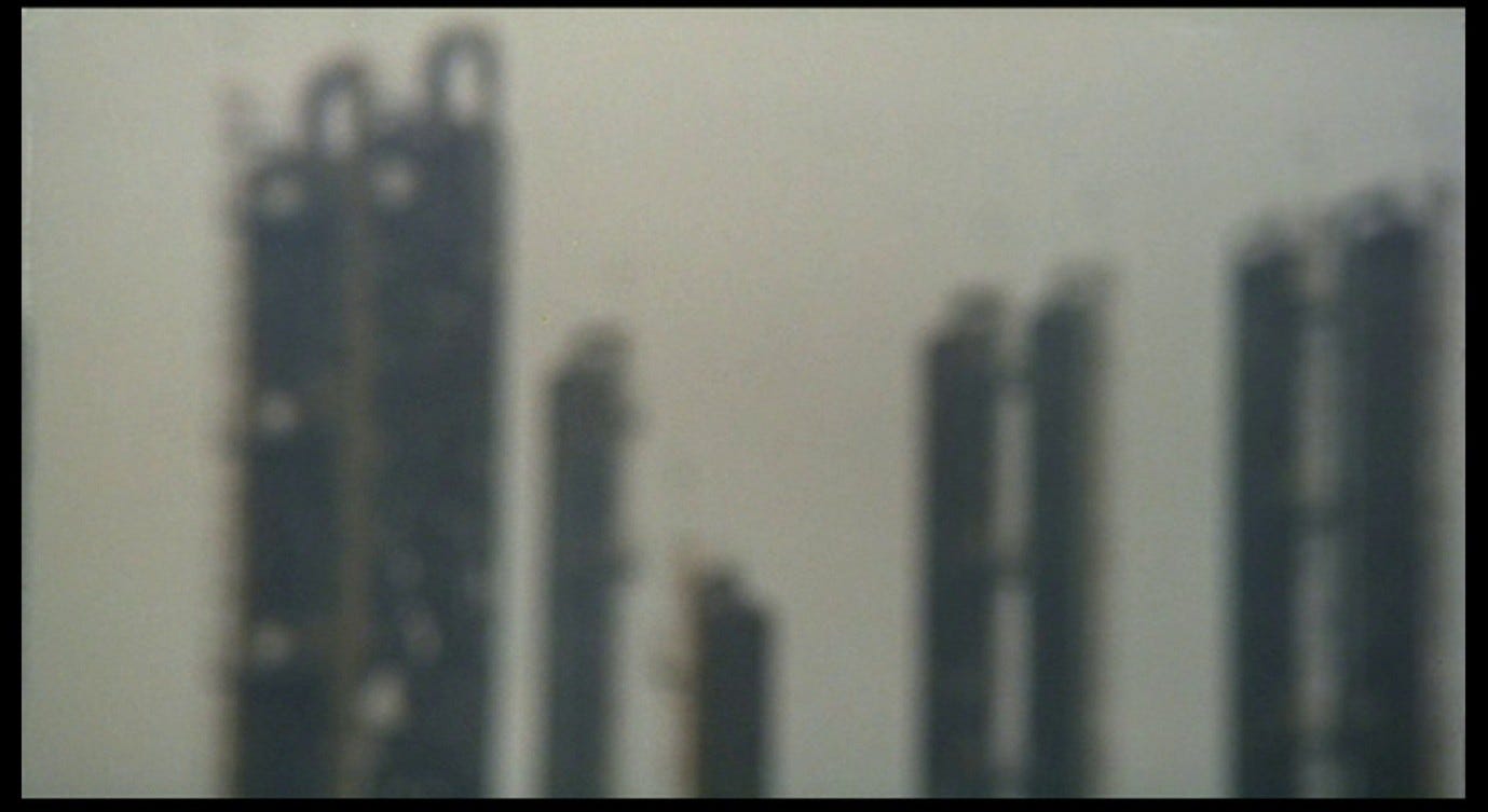
In the final moments of Red Desert, Giuliana will tell her son that yellow, in an industrial setting, signifies poison. Thin streaks of yellow can be seen in many of the images in the title sequence: sometimes these are stains caused by pollutants; at other times, as in shot 1, they are objects (such as ladders) deliberately painted yellow to give them high visibility. Yellow is a vital safety measure, but by the same token it is a glaring indicator that something dangerous has intruded upon our world.
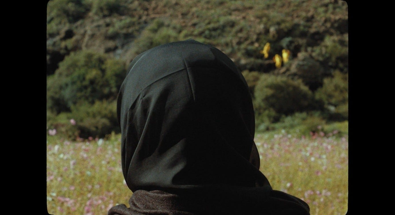
In This is Not a Burial, It’s a Resurrection, the imminent destruction of Mantoa’s village is signalled by the arrival of engineers in high-vis yellow outfits. We first see them in a composition that recalls Red Desert, with Mantoa’s head (in focus) in the foreground and the yellow intruders (slightly out of focus) passing across the landscape in the background.
A few seconds later, there is a long shot showing the high-vis engineers in focus, which then zooms out until they become blurry – just as Mantoa (in focus) appears in frame. The zoom-out returns us to Mantoa’s Giuliana-esque point of view, in which these intruders appear as de-individualised stains.
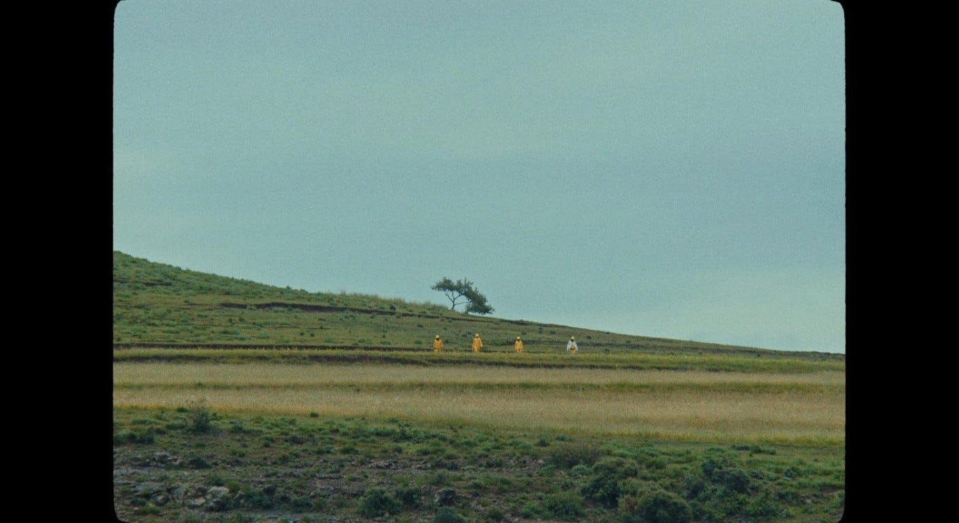
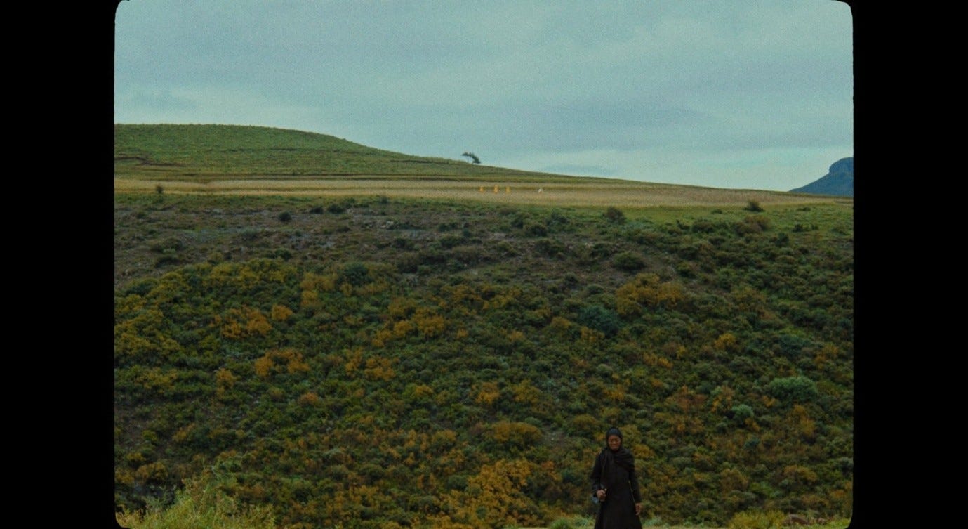
Later, we see the back of Mantoa’s head in focus and the engineers in the far distance appear like yellow smudges on the landscape she is gazing at. We then cut to a wide shot of Mantoa, in the centre of a composition displaying the valley’s full beauty and grandeur, all in focus.
We have spent most of the first half of This Is Not a Burial in this rural, not-yet-poisoned environment. When the high-vis jackets then appear in the Plains of Weeping, we have a powerful sense of the in-focus world they are intruding upon, and we understand Mantoa’s outrage when she sees this world beginning to disintegrate. In contrast, from the first seconds of Red Desert, we find the trees already leeched of colour, already out of focus, and a toxic yellow appears almost immediately as an ingrained component of the landscape.
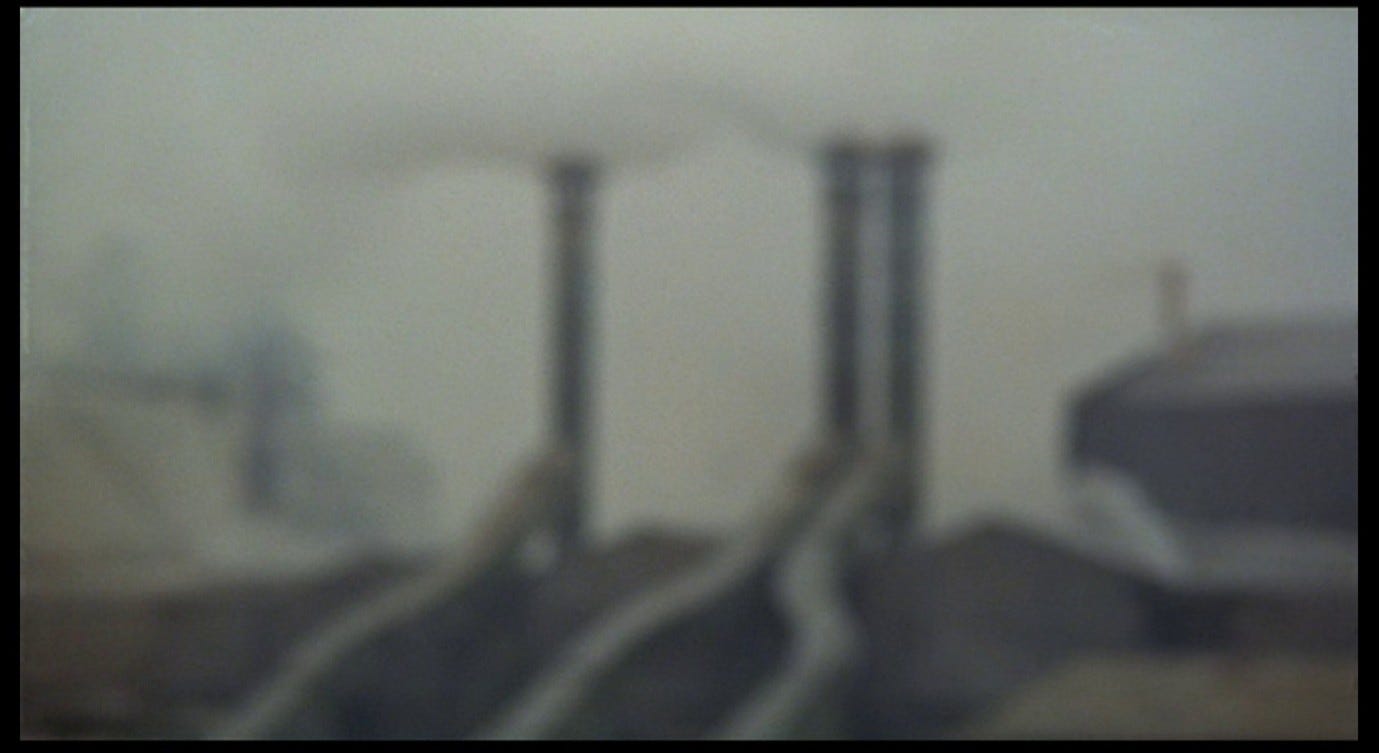
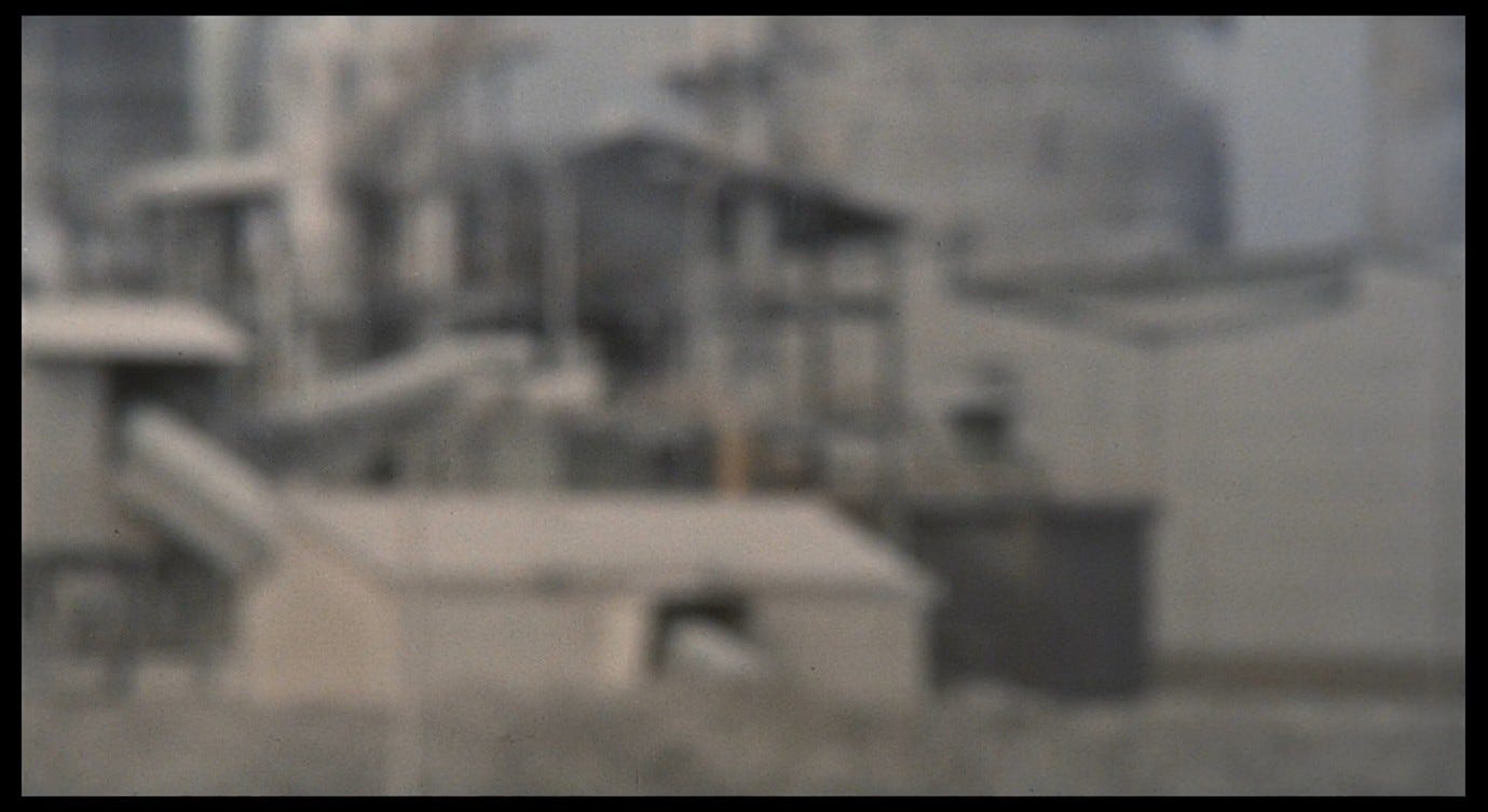
The yellow is still present in the second shot of the title sequence, though more muted.

It stains the building on the left and the upper sections of the grey pipes that extend from below the frame; a small chimney on the right also appears to be painted yellow. There is a hint of blue in the obscure building on the left, but otherwise this image is again dominated by the grey sky and the dark browns of the industrial buildings. The first shot began with three tree trunks rising up from below; in shot 2 there are three grey pipes, and here we have another instance of the ‘single’ juxtaposed with a ‘couple’ (a common visual trope in Antonioni’s films). Instead of the leafy canopies, there are three stark chimneys, and instead of oxygen they emit smoke into the sky. If the trees appeared to be dissolving into a grey void, the smoke exacerbates that effect here, creating the visual impression that the industrial piping and the overcast sky are in a symbiotic relationship. The first appearance of smoke in Red Desert is as significant as the first appearance of yellow: smoke, steam, and fog are integral to this film’s exploration of ‘how Giuliana sees’, and specifically of how she sees her poisoned, smog-ridden, amorphous environment.
This environment is one of the meanings denoted by the film’s title, and it is over this second shot that the words ‘IL DESERTO ROSSO’ appear.
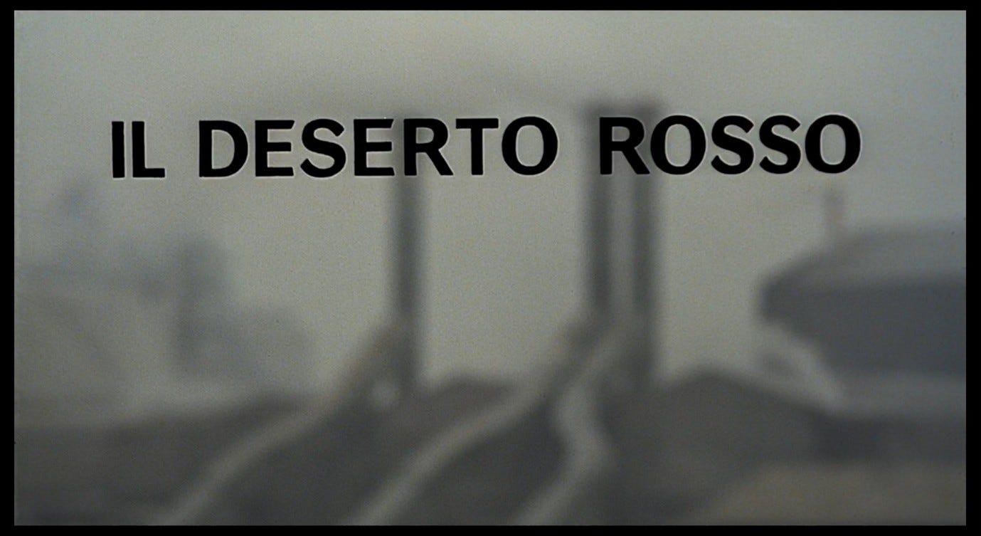
The image is conspicuously free of the colour red, and the lettering used for the title is (like Vitti’s credit) black, not to mention that what we are looking at does not immediately appear to be a desert. The desert and its redness will not be visible as such to the naked eye. In signalling that we should not read its title too obviously, the film is also hinting that it may be reductive to attach a single metaphorical meaning to it. In a 1964 interview, Antonioni himself explained the title in hesitant, allusive terms:
It is not a symbolic title. Titles of this kind have an umbilical cord linking them with the work. I don’t really know why. It’s an open title, and everyone can read into it what they like. ‘Desert’ perhaps because there are few oases left; ‘red’ because it’s blood. The living, bleeding desert, full of the flesh of men.2
The metaphor of the umbilical cord suggests that the title emerges organically from the film, or vice versa, in a symbiotic relationship not unlike that between the factory, smoke, and grey sky we are currently looking at. But Antonioni’s metaphor also suggests that the title and the film can be separated and exist independently of each other. This, I think, is part of what he means when he says it is ‘not a symbolic title.’ The title of The Bell Jar is clearly symbolic, and refers to a symbol used several times in that novel. In Antonioni’s film, the phrase ‘red desert’ is never used, but the title can be read quite literally, as a description of what we see on the screen. What, after all, constitutes a literal desert: does it have to be made of sand or can it be any desolate or deserted space? Giuliana feels desolate and deserted, so why shouldn’t her internal or external environment be described as a desert? If that internal or external environment is literally full of flesh and blood – which it is – can it be described as literally red, even though it may not appear red to the naked eye? ‘C’est le sang,’ says Antonioni; it (i.e. this desert) is blood, and there is blood in it; why not say that it is non-symbolically living and bloody? Indeed, this is a peculiarly vivid way of evoking Giuliana’s crisis of relationship with her own and other people’s bodies.
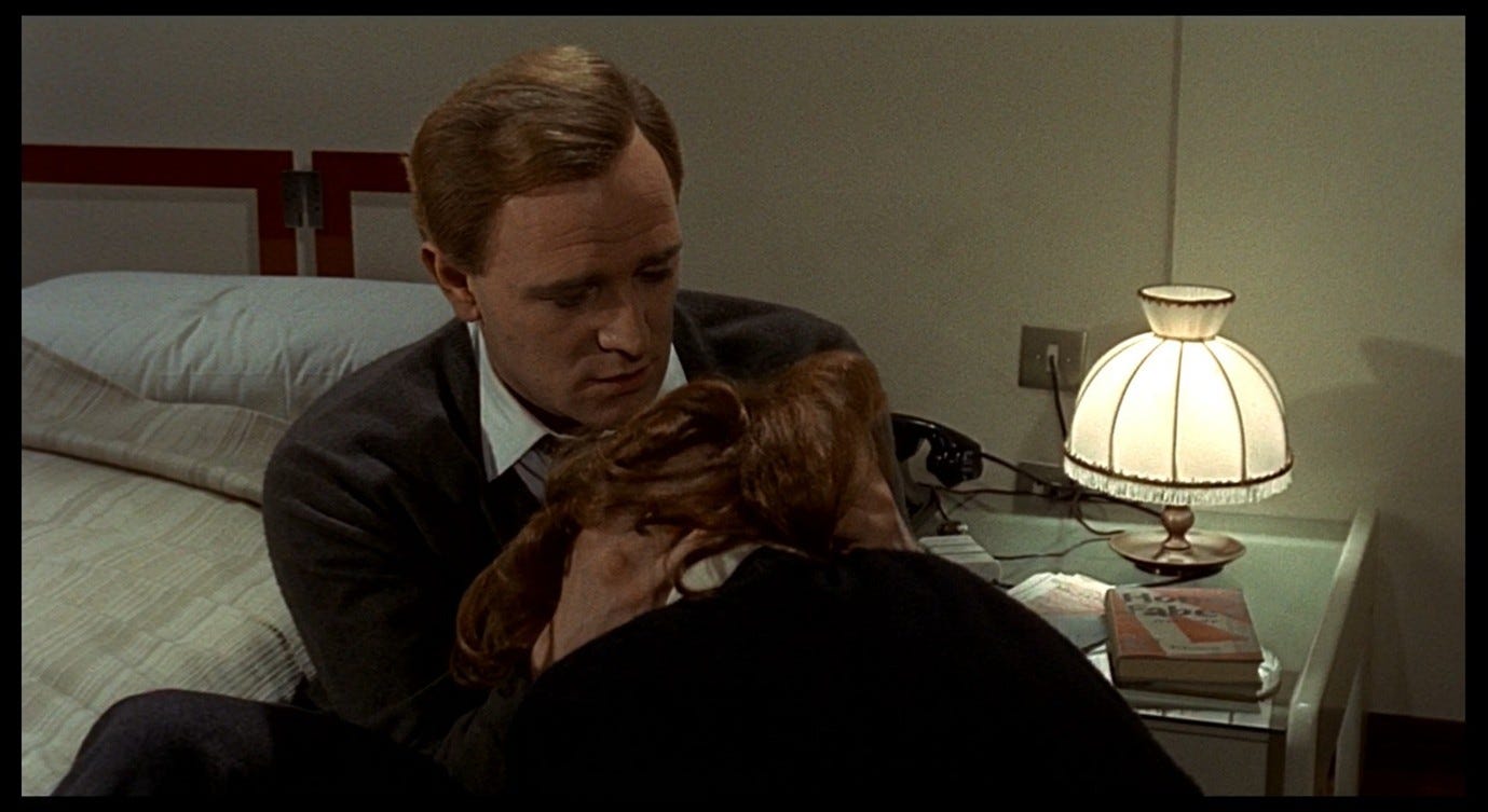
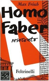
The phrase ‘the red desert’ occurs near the beginning of Max Frisch’s novel Homo Faber. A plane is crash-landing in a remote part of Mexico, and one of the passengers, Walter Faber, describes the view from the plane window: ‘In the distance the blue mountains. Sierra Madre Oriental. Below us the red desert.’3 Towards the end of Red Desert, we will see the 1959 Italian edition of Homo Faber on Corrado’s bedside table, in which the final phrase of the passage just quoted reads, ‘il deserto rosso.’4
In Part 44 of this series, I will discuss the relation between Frisch’s novel and Antonioni’s film in more detail, but it is worth making a few preliminary remarks about this likely source of Red Desert’s title.
In Frisch’s novel, the red desert is a literal and specific one at first, but as the story progresses it takes on a larger significance. Homo Faber is, among other things, about a man whose scientific approach to reality is eroded by several traumatic experiences. At the start, Faber will insist that one thing can be like another but that one thing cannot literally be another; each thing’s essence remains fixed and stable. By the end, he inhabits a red desert that follows him wherever he goes. It is not simply that his environment is like a red desert, metaphorically speaking, but that it is one, even when he is not surrounded by an expanse of red sand:
Since my forced landing in Tamaulipas I have always sat so that I can see the undercarriage when they lower it, anxious to observe whether the runway at the last minute, when the wheels touch it, does not after all change into a desert.5
Faber’s red desert is like Giuliana’s. It is not just a question of where you physically are, it is also about your state of mind and your mode of perception. When we see ‘IL DESERTO ROSSO’ appear on the screen, we may already begin to understand that this title applies as much to the blurriness and instability of the image as to the dehumanising industrial complex we find ourselves squinting at.
As I said above, the ‘blurriness and instability’ are compounded by the grey sky and the smoke that pours from the factories. Smoke becomes more prominent as the title sequence progresses. It is barely visible above the chimneys in shot 2.
Then it pours from both the right and bottom-left of the frame in shot 3.
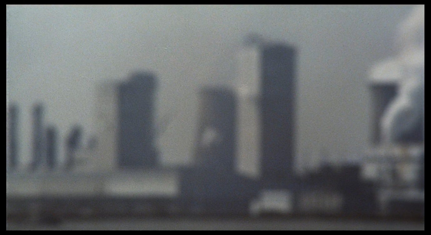
And in the course of shot 4 (which pans across a long rooftop) we see separate streams of smoke at the top, middle, and bottom of the frame.

In shot 8, in parts of the image, it is hard to tell whether we are looking at smoke or just the grey/white of the sky. The image is so out of focus that we may feel like we have smoke in our eyes, or that we are victims of the Ravenna fog that will feature prominently later in the film.
In shot 15, a stream of smoke seems to flow behind the building on the right-hand side, but as with the trees in shot 1, the long lens makes it hard to tell how the layers of this image relate to each other. The smoke is an increasingly prevalent obscuring force whose origin and location are also obscure.
After the initial dull greens and faint yellows in shot 1, more colours, and more noticeable colours, gradually appear. We see many more instances of yellow in both its functions, as a residual mark of pollutants and as a deliberate way of heightening visibility. In shot 5 we see a distant field of orb-like structures, each partially encased in a dark covering, making them resemble severed eyes still wrapped in their sockets.
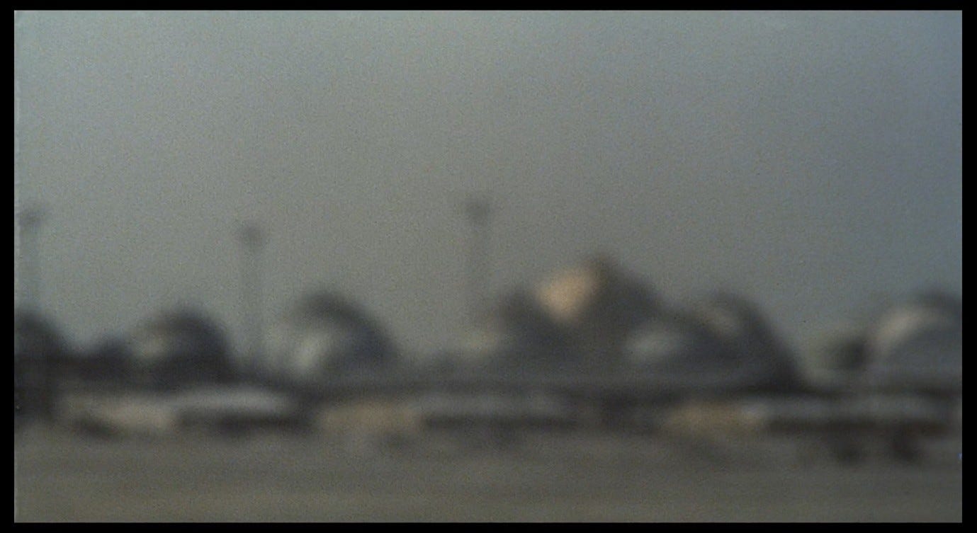
Most of the orbs appear light blue, but one is distinctly yellow and the others have a slight yellow tinge. In the foreground are three vehicles, possibly trailers, painted yellow at the ends facing us. The yellow on the orbs seems inconsistent, like staining; the yellow on the vehicles seems more deliberate.
We then see more yellow-stained buildings with a yellowish haze around them (shot 6).
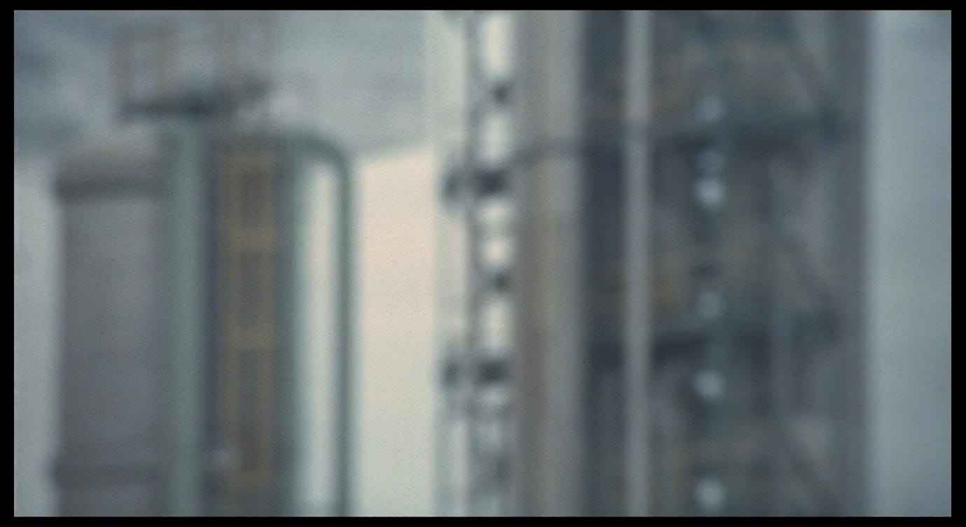
The smudged yellow lines of high-vis stairways and scaffolding (shots 15 and 16).
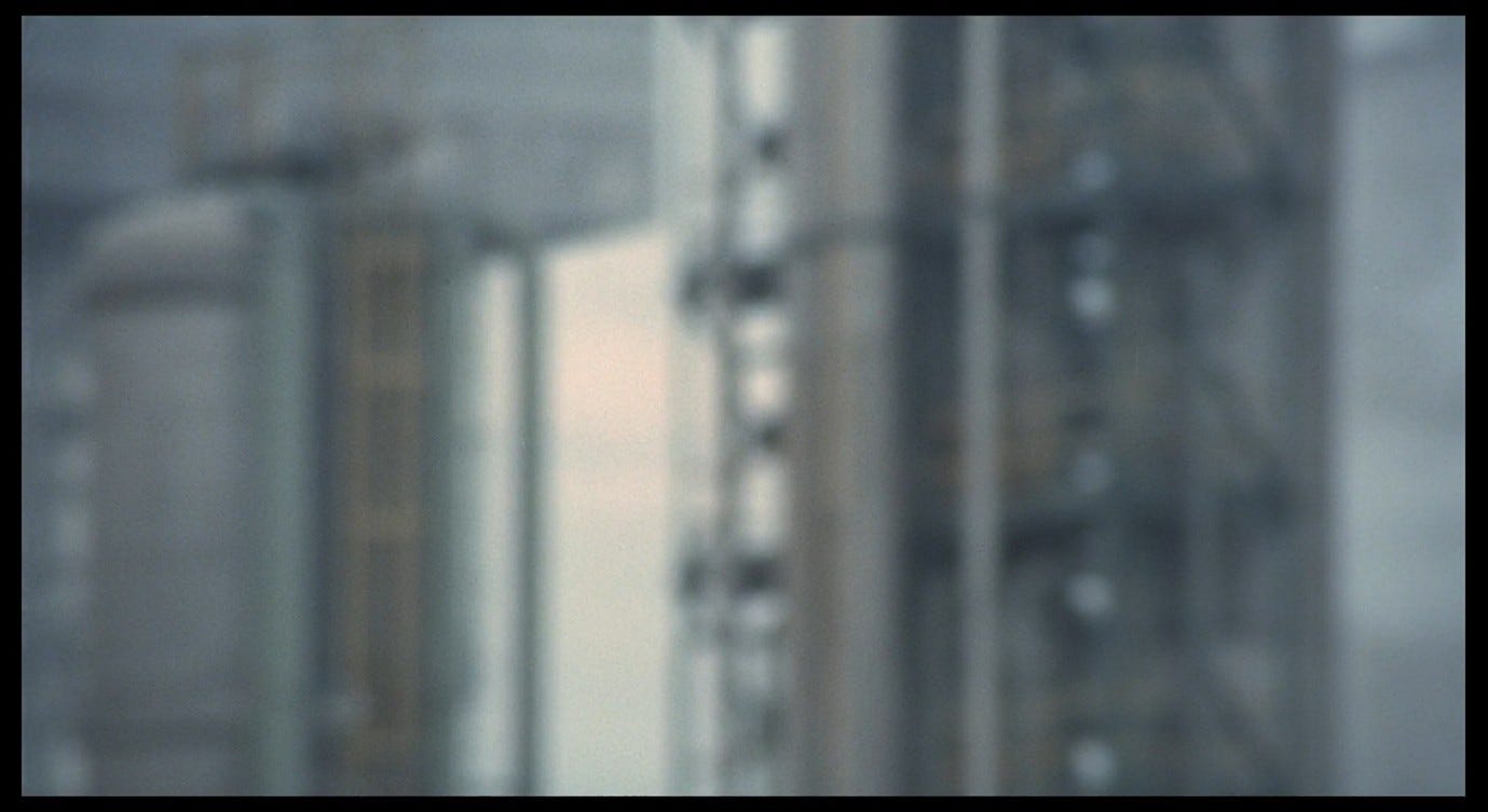
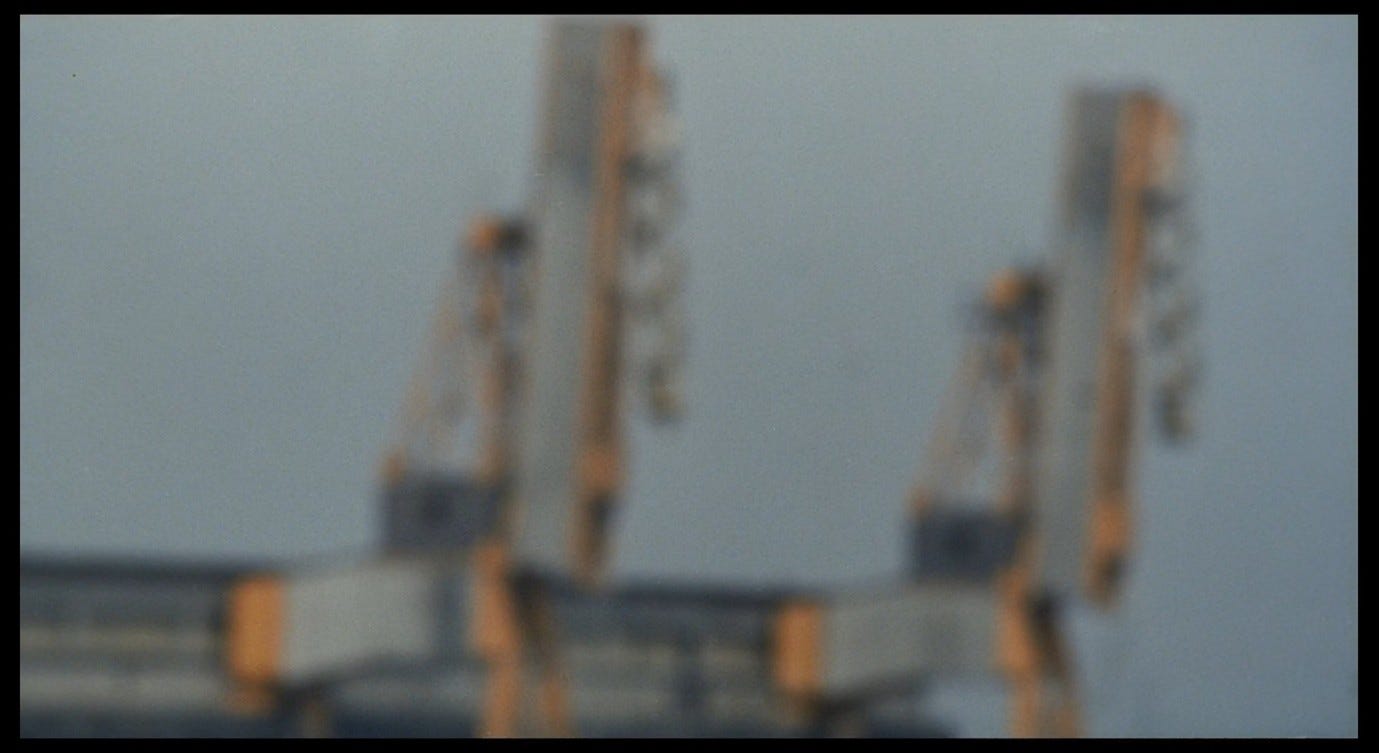
And orange/yellow loading cranes among other orange-lined structures in shot 18, which pans rapidly across the docklands.
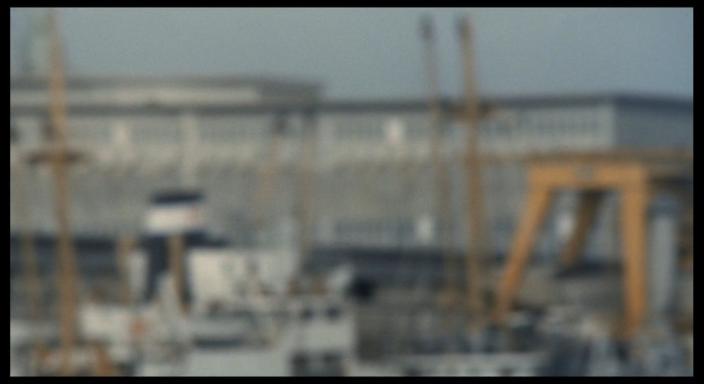
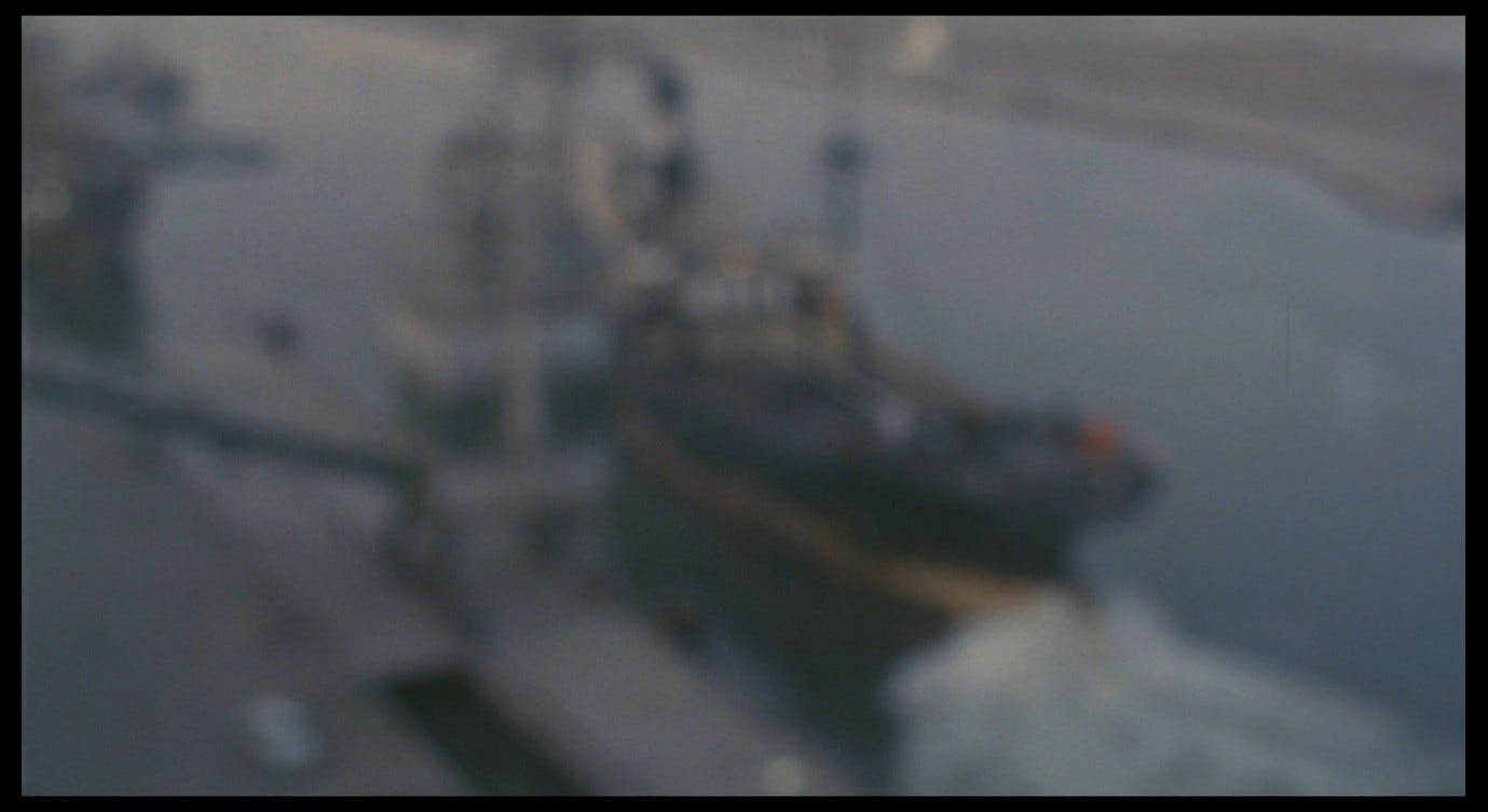
In this last example, we seem to be attaining a clearer sense of the objects on display, as though we were driving along the banks of the canal and recognising the ships and cranes we see out of the window. The final shot of the title sequence adopts an uncharacteristically high angle, looking down at a ship moving slowly along the canal, its lower hull painted yellow.
These 19 shots work very well as establishing shots, in that they tell us where this film is set and that colours (especially yellow) have a function in this world. But there is something dizzying about that final shot, just as there was something dizzying about looking up at the trees and craning our necks to see the factory spires in shot 1. Those big bright objects at the end of shot 18 are clearly loading cranes, but they are something else as well. The camera comes to a halt when it finds them, partly because it recognises them, but also perhaps because it finds them monstrous.
As Murray Pomerance says:
The colour effects we see in Antonioni’s films are often abstract, in the sense that they are meant to approach and transform the viewer without specific practical reference to the objects in which they inhere. An appreciation of Antonioni’s colour films requires that the viewer really let colour work, and this is ultimately a commitment that transcends rationality.6
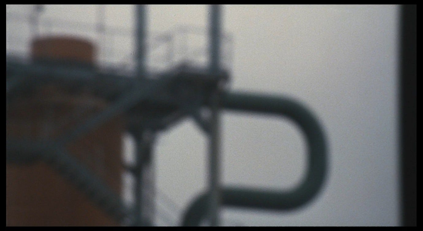
The title sequence prompts us to reflect on the practical functions of colour, but also to respond to colours in a way that transcends or subverts these functions, in ways that are perhaps irrational. Consider the effect(s) of the colour red. There are noticeably few red objects in these 19 shots. The first is a small chimney in shot 4.
In shot 9, there is a reddish orange in the middle of the frame (this seems to be a chimney spouting smoke), on the upper parts of the dark scaffolding, and (very thinly) along the upper part of the dark structure on the right.
Shot 10 is one of the most colourful, including a reddish tank with blue stairs on the left-hand side (which I think we see again, from a closer angle, in shot 11), some yellow/orange pipes, and a credit for the Tintal colours provided by the ‘colorificio’ (paint shop/factory) Max Meyer.
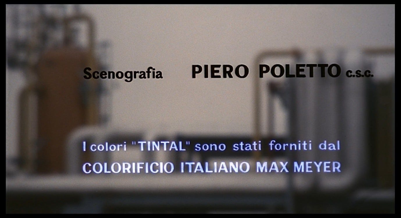
Shot 10 is unusual in that it gives us no breathing room before and after the appearance of the credit: in every other case there is a momentary pause on the credit-less image at the start and end of the shot. There may be a simple practical reason for this, but the effect is to give the Tintal colour credit a breathless quality, and I find it significant that this (subliminally) anxiety-inducing effect accompanies the first conspicuous appearance of the colour red, which then cuts to a closer view of the same red object. If yellow signifies poison, red signifies a less specific kind of danger. Colours work in many ways in this film: sometimes they tell us to be afraid, to worry, with or without a rational cause.
As a counterpoint to my anxious reaction to shot 10, here is Matilde Nardelli’s more down-to-earth reading of the colour credit:
The film’s opening titles credit the use of ‘Tintal’ colours, a line of washable household paints launched by the manufacturer Max Mayer [sic] in the early 1950s (and whose development and specific function, as an industrial product for consumer use in the improvement of property, is emblematic of Italy’s economic miracle and building boom in those years). If the relation of these colour-paints to Antonioni’s interventions on the pro-filmic is not spelled out, the mention nevertheless attracts attention to colour as material – even, indeed, as product. […] Widely seen as the most pictorial and abstract of Antonioni’s films because of its particular use of colour, the film is also profoundly engaged with the material reality – the prosaic concreteness – of painting.7
Audiences in 1964 were used to seeing film titles herald the brands of ‘glorious Technicolor, breathtaking Cinemascope’ (etc.) in a celebratory tone, as though to impress upon us how special this experience is and how lucky we are not to be sitting at home in front of a black-and-white television. It is unusual to credit the brand of paint used to decorate filming locations, and in this case the credit appears over distinctly un-glorious and out-of-focus images of an industrial landscape. We are invited to see colour (in Antonioni’s first colour film) not as a treat for the eyes we can only find in the cinema, but as an echo of the domestic and professional spaces from which the cinema is supposed to help us escape.
This 1964 advert for Tintal features the film star Sylva Koscina, her hair wrapped in a protective black headscarf, smiling as she rolls a column of red paint in front of her face.8

Behind her are pink, green, and white spaces creating a 3-D effect, as though Koscina were painting herself into a box. Once she has finished painting this red wall she will be completely enclosed. This, we are supposed to think, is the paint that glamorous film stars use to decorate their private domestic spaces. If we use it in our own homes we can in some sense emulate the lifestyles of those stars. The advert tells us that the paint can be easily applied ‘with your own hands,’ and calls it ‘la bella pittura per le pareti’ (‘beautiful paint for walls’), associating the beauty of Sylva Koscina (which adorns this magazine page) with the beauty of this paint (which will soon adorn our living rooms). There is something unintentionally nightmarish about Koscina erasing her own face, her own bellezza, with the bella product her face is being used to sell, all the more so because she seems to be doing this as a way of escaping from the prying eyes of her fans, into the safety of her door-less, window-less Tintal-box. This is beautiful paint for walls, but here Koscina’s face is also a wall to be painted over, a wall to hide behind. Imagine if they’d hired Monica Vitti instead.
Another Tintal advert promises ‘the colours of the world in your home,’ but undercuts this message by contrasting a photograph of a verdant forest (above) with a solid rectangle of unvarying ‘Tintal Verde’ green (below), diligently painted by an apron-wearing cartoon-woman on a stepladder.9
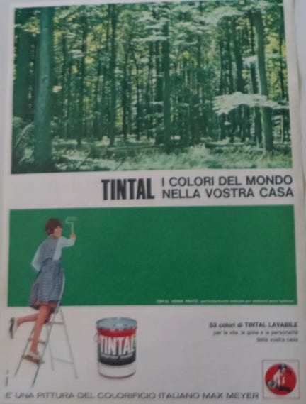
Her face is so close to the wall that she cannot look up and see the sunlit forest above her. The implication is that she can conjure the forest in her mind, like a thought-bubble, by reproducing its colour in her home, even if the forest itself is inaccessible (perhaps because it no longer exists). The text in the lower-right portion of the advert promises that Tintal colours will imbue your home with ‘life, joy, and personality,’ but this feels ironic when juxtaposed with a picture of a woman whose face, seen in quarter-profile, seems to be turning into a featureless pink blob.
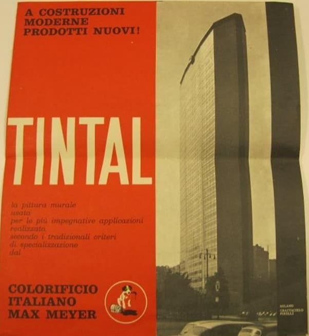
Another advert emphasises Tintal’s modernity, though rooted in traditional standards of paint-making expertise, and its suitability for ‘the most demanding applications,’ such as the Pirelli tower in Milan which occupies the right-hand side of the poster.10
All these adverts foreground the name of the company that owns the Tintal brand, Max Meyer. Meyer was a Swiss entrepreneur who founded the company in Milan in 1895,11 and I wonder if Antonioni was thinking of him when he named Red Desert’s most successful industrialist ‘Max’. Max introduces himself by saying that his name is ‘half German’, associating him with northern-European émigrés to Italy like Meyer, and he then hosts a party in his own Tintal-box (the shack in Porto Corsini). Tintal could have capitalised on these Antonioni connections in their advertising. Remember the terrifying skyscraper at the start of La notte? Remember the creepy colour scheme in Max’s shack in Red Desert? Remember how these films made you feel that the natural world was a long-lost oasis usurped by a world-devouring Mark Rothko painting, and that Italy’s economic miracle was also kind of a nightmare? It was all done with Tintal (from Max Meyer).
Perhaps the most interesting colour in Red Desert’s title sequence is the one that we don’t see, but that is referred to in a credit, in shot 17: ‘Thanks to Piero Tizzoni of Milan for giving us the use of his pink beach [spiaggia rosa] on the island of Budelli in Sardinia.’ It is not necessary, for the purposes of this credit, to specify the colour of the beach, and this gratuitous detail invites us to consider the possible relationship between il deserto rosso, the red desert, and la spiaggia rosa, the pink beach: two expanses of sand; one masculine, one feminine; one rosso, one rosa. Already we may sense that a pink beach would seem very out of place in the world we are looking at. The brief appearances of colours like blue and green in the title sequence call attention to the absence of a blue sky, and to the paucity of green grass in the few shots where we can see the ground (shot 17 is one of these).
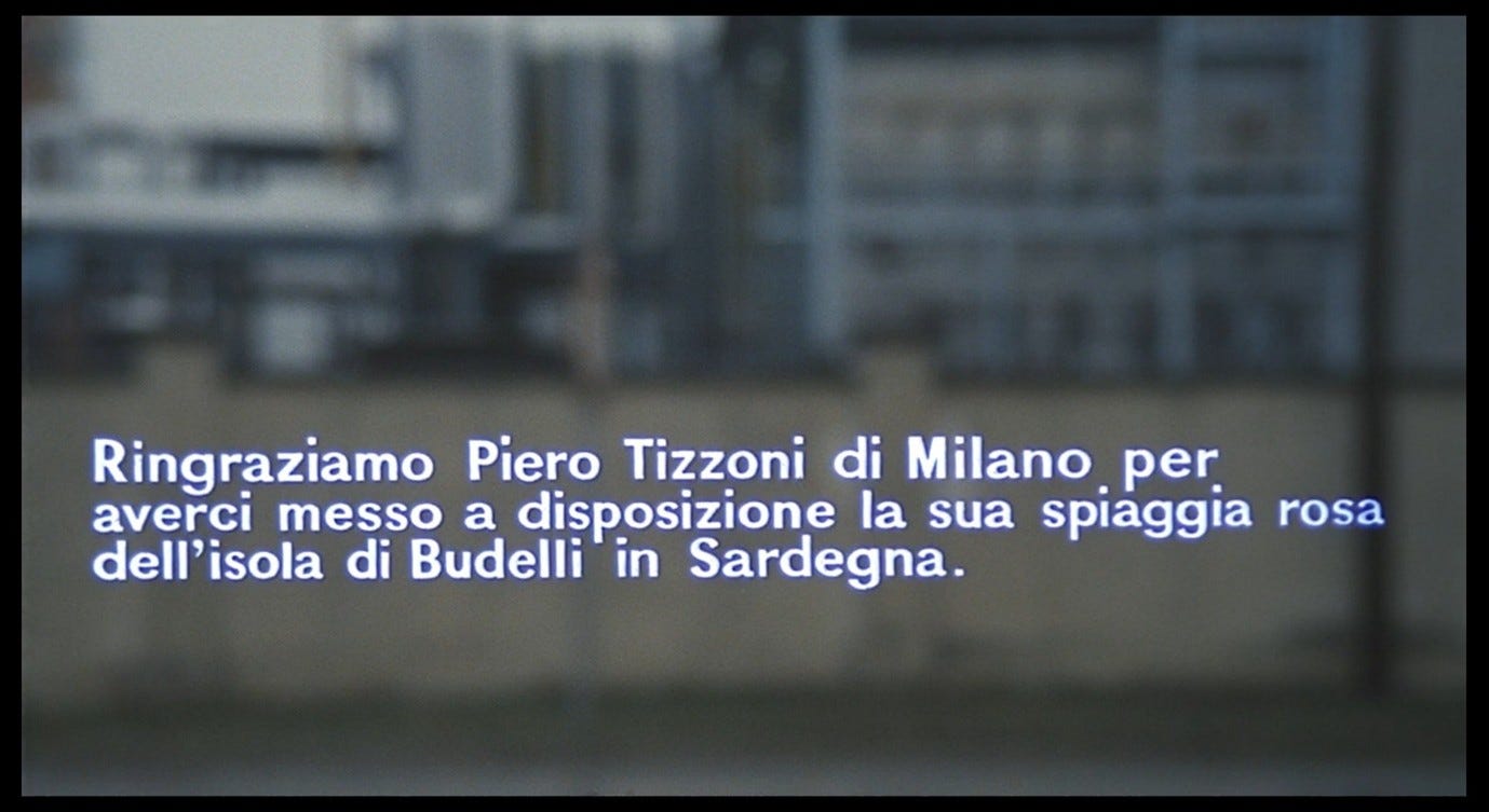
Special permission had to be obtained to gain access to a pink beach, because as Antonioni said, ‘there are few oases left.’ When that beach does appear in the film, it will exist in a fantasy realm in Giuliana’s mind, where the ‘colours of nature’ predominate and are in stark contrast to the colour-coded paint and toxic staining she lives with every day.
Elena Past notes that Piero Tizzoni, a Lombard developer, was exploiting Budelli (and other parts of Sardinia) for tourism purposes, and that in subsequent decades the island has been fought over by private owners and state organisations attempting to protect it:
If on the Adriatic side of Italy, the film was already cognizant of petroleum in the bellies of Ravennan eels, the Budelli Island shows that our constructions of a ‘pristine nature’ have always mistakenly been, as [Timothy] Morton ([The Ecological Thought] 2010, 5) suggests, ‘the mirror image of private property: Keep off the Grass, Do Not Touch, Not for Sale.’12
Crediting Tizzoni, the owner of this location, in the title sequence of Red Desert is not unlike crediting Max Meyer (or the company that bears his name) for the film’s other colours: these components of the film, these colours and these locations, are the legal possessions of a person or company who has had to sell or loan them to the film-makers.
Millicent Marcus is not wrong to say that ‘The industrial city and pink beach are polar opposites in every way […] one is shot with color and lens distortions, the other in unblemished technicolor,’ or that the pink beach represents ‘Giuliana’s personal myth of Eden, a place where the primal unity between the self and the world has not yet been split asunder by guilty knowledge or willful rebellion against the natural order.’13 But Antonioni cannot have made his arrangements with Tizzoni without being conscious that the naturally occurring pinkness of this beach was a commercial selling-point used to attract tourists. The pinkness derives, in fact, from ‘tiny dead marine creatures that live in the roots of the marine grasses along the shore,’14 and in that sense is not so different from the redness of the red desert, marbled with human flesh and blood.
Next: Part 3, Noise and noise-music.
View the Contents post to browse the full series.
Follow me on BlueSky and/or Twitter.
For this and the next screenshot from Red Desert, I have used the Criterion DVD rather than the BFI blu-ray, as the yellow haze is slightly more visible on the Criterion edition. This may or may not be in line with Antonioni’s original intentions.
Manceaux, Michèle, ‘Dans le Désert rouge’, L’express (16 January 1964), pp. 19-21; p. 20. My translation. An edited version of this interview (which missed out some important details) appeared in English as ‘In the Red Desert’ in Sight and Sound 33, 3 (Summer 1964). Arrowsmith (Poet of Images, p. 85) quotes more of Antonioni’s answer but does not translate ‘vivant’, translates ‘c’est’ as ‘there is’, ‘saignant’ as ‘blood-stained’, and ‘chair’ as ‘bones’. Here is the full passage in French: ‘Ce n’est pas un titre symbolique. Les titres de ce genre ont un cordon ombilical avec l’ œuvre. Je ne sais pas très bien pourquoi. Chacun peut y mettre ce qu’il veut. C’est un titre ouvert. “Désert” peut-être parce qu’il n’y a plus beaucoup d’oasis, “rouge” parce que c’est le sang. Le désert saignant, vivant, plein de la chair des hommes.’
Frisch, Max, Homo Faber (London: Penguin, 2006), trans. Michael Bullock (1959), p. 16
Frisch, Max, Homo Faber (Milan: Feltrinelli, 2005), trans. Aloisio Rendi (1959), p. 20
Frisch, Max, Homo Faber (London: Penguin, 2006), trans. Michael Bullock (1959), p. 207
Pomerance, Murray, ‘Notes on Some Limits of Technicolor: The Antonioni Case’, Senses of Cinema 53 (2009)
Nardelli, Matilde, Antonioni and the Aesthetics of Impurity: Remaking the Image in the 1960s (Edinburgh: Edinburgh University Press, 2020), pp. 33-34
Image posted by ebay.it seller ‘stems23’, item listed as ‘advertising Advertising 1964 TINTAL MAX MEYER’
Image posted by ebay.it seller ‘stems23’, item listed as ‘advertising Advertising 1967 TINTAL MAX MEYER’
Image posted by AbeBooks.it seller ‘Coenobium Antiquarian Bookshop’, item listed as ‘Colorificio italiano Max Meyer. Tintal the wall paint used for the most demanding applications made according to the traditional criteria of specialization by.’
History webpage on MaxMeyer.com
Past, Elena, Italian Ecocinema: Beyond the Human (Bloomington: Indiana University Press, 2019), p. 45
Marcus, Millicent, Italian Film in the Light of Neorealism (Princeton: Princeton University Press, 1986), p. 202
Heinrich, Nathan, ‘The Pink Sand Beach: Sardinia Italy’, All Roads Lead to Italy (19 March 2024)